Color palette guide with Pantone colors for Spring/Summer 2019 NYFW with HEX, CMYK and RGB values
Table of Contents
Pantone color palette for Spring/Summer 2019 NYFW again brings to you the color guard for your images and artwork with the fresh breeze and positive energy.
Let’s see and color match these swatches.
In September, the color experts from Pantone LLC, an X-Rite company again announced its top 12 PANTONE Fashion Color Trend Report Spring 2019 in Color palette Pantone, a comprehensive overview for New York Fashion Week.
This color palette guard will help you to create art, or to keep consistency in using this color palette across all your design ideas, company materials, or just fresh feeling to your website.
Use these 12 Spring/Summer 2019 NYFW Color Palette and 4 Spring/Summer 2019 Neutrals in HEX, CMYK, and RGB values as I collected the color values for you.
Color Palette of Pantone 12 Spring/Summer 2019 NYFW color
© PANTONE 17-1564 Fiesta
HEX #de4d44 | CMYK 4, 81, 70, 1 | RGB 221, 77, 67

Color descriptions by The Pantone Color Institute:
A festive orange red, Fiesta radiates energy, passion and excitement.
© PANTONE 19-1862 Jester Red
HEX #9e3744 | CMYK 25, 88, 59, 21 | RGB 157, 55, 68

Color descriptions by The Pantone Color Institute:
Adding depth and intensity, Jester Red combines rich elegance with urbanity.
© PANTONE 15-1264 Turmeric
HEX #ff842a | CMYK 0, 58, 86, 0 | RGB 254, 132, 42

Color descriptions by The Pantone Color Institute:
Turmeric is an enlivening orange that infuses a hint of pungency into the palette.
© PANTONE 16-1546 Living Coral
HEX #fc766a | CMYK 0, 66, 50, 0 | RGB 252, 118, 106

Color descriptions by The Pantone Color Institute:
Living Coral is an affable and animating shade whose golden undertone gives it a softer edge.
© PANTONE 18-2045 Pink Peacock
HEX #c83e74 | CMYK 15, 87, 22, 2 | RGB 200, 62, 115

Color descriptions by The Pantone Color Institute:
The tantalizingly theatrical Pink Peacock fans out to a feast for the eyes.
© PANTONE 17-0542 Pepper Stem
HEX #8d9440| CMYK 46, 30, 82, 14 | RGB 141, 148, 64
Color descriptions by The Pantone Color Institute:
Zesty yellow-green Pepper Stem encourages our desire for nature’s healthy bounty.
© PANTONE 13-0850 Aspen Gold
HEX #fed65e | CMYK 2, 17, 67, 0 | RGB 253, 214, 94

Color descriptions by The Pantone Color Institute:
Brightening our day, sunny Aspen Gold stimulates feelings of joy and good cheer.
© PANTONE 19-4150 Princess Blue
HEX #2e5d9f | CMYK 89, 63, 6, 0 | RGB 45, 92, 158

Color descriptions by The Pantone Color Institute:
Princess Blue, a majestic royal blue hue, glistens and gleams.
© PANTONE 18-1031 Toffee
HEX #755841 | CMYK 37, 54, 67, 43 | RGB 117, 87, 65

Color descriptions by The Pantone Color Institute:
Deliciously irresistible, tasteful Toffee whets the appetite.
© PANTONE 15-0960 Mango Mojito
HEX #daa03d | CMYK 13, 38, 86, 2 | RGB 217, 159, 60

Color descriptions by The Pantone Color Institute:
The golden yellow Mango Mojito feeds our craving for pleasant comforts.
© PANTONE 18-0416 Terrarium Moss
HEX #616247 | CMYK 56, 44, 66, 38 | RGB 97, 98, 71

Color descriptions by The Pantone Color Institute:
Terrarium Moss conjures up thoughts of flourishing foliage and the physical beauty in the natural world.
© PANTONE 14-2808 Sweet Lilac
HEX #e7b7cf | CMYK 7, 36, 4, 0 | RGB 231, 182, 207

Color descriptions by The Pantone Color Institute:
An endearing pink infused lavender, Sweet Lilac’s easy and gentle manner quietly charms.
© PANTONE 4 Spring/Summer 2019 Neutrals:
© PANTONE 13-0919 Soybean
HEX #d7c49e | CMYK 17, 20, 41, 2 | RGB 215, 196, 157

Color descriptions by The Pantone Color Institute:
Subtle Soybean naturally appeals as a reliable and versatile neutral.
© PANTONE 19-3810 Eclipse
HEX #3b3a50 | CMYK 82, 75, 42, 41 | RGB 59, 58, 80

Color descriptions by The Pantone Color Institute:
A deep blue redolent of the midnight sky, thoughtful Eclipse is both serious and mysterious.
© PANTONE 11-0106 Sweet Corn
HEX #f2edd7 | CMYK 6, 5, 19, 0 | RGB 242, 237, 215

Color descriptions by The Pantone Color Institute:
Sweet Corn tempts with its soft and buttery attitude.
© PANTONE 19-0805 Brown Granite
HEX #615550 | CMYK 51, 51, 51, 45 | RGB 97, 85, 80

Color descriptions by The Pantone Color Institute:
Grounded and strong, Brown Granite is understated, authentic and timeless.
PANTONE COLORS CONCLUSION
I believe you will find using this colors usefull and your artwork will stand out from others. This is the reason why we look ahead and give to our work something extraordinary such these colors.
Keep in mind that the HEX colors values are very important in online art such website colors, text and CMYK colors values for print.
TIP: Find any ©PANTONE color at this link.
Remember, for colors available on paper for PRINT there are TPX and TPG color values.
How do you use color swatches to edit your images and artwork? Do you know how to add more cool looking style that brings more likes or customers? Let me know how do you like this Spring colors for 2019! Share your opinions with us!
PANTONE© and other Pantone trademarks are the property of Pantone LLC.
Learn 5 crucial steps in image editing.
Do you know them?

This free ebook will help you
- to analyze
- to prepare
- to edit
- to finish
- export images


 Pantone colors, the great palette for Spring & Summer 2022
Pantone colors palette for Spring/Summer (2022) NYFW again brings to you amazing…
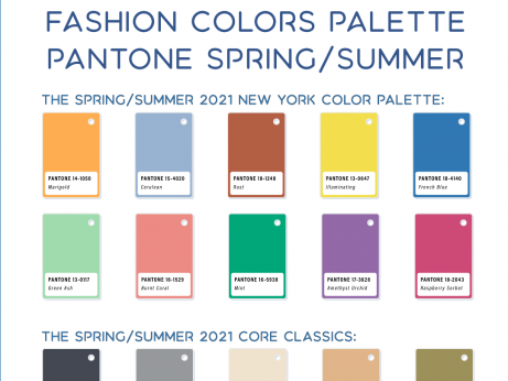 Color palette Pantone Spring Summer 2021
Pantone color palette for Spring/Summer (2021) NYFW again brings to you amazing…
 Color palette Pantone for Spring Summer 2020 NYFW and color of the year
Pantone color palette for Spring/Summer 2020 NYFW again brings to you the color…
Thanks for the post. Here you can read more details about 18 colors of spring 2019 http://fason.info/modnye-cveta-vesny-2019/
4/3/19 Hi, I have to tell you, I appreciate this however when inputting these Hex#’s into Gimp or Inkscape, none of the CMYK nor RGB come out to the same formulas as yours above here. Very perplexing… Wish there were an easy way to do these conversions, I know, I know LIGHT vs INK, I get it, just frustrating. Tks.
All the colors and its values are copied from Pantone web site resource, so if there is some numbers that are different in color spectre of CMYK, RGB or HEX inserted into different apps, I recommend used to use numbers set by Pantone.